When I first got started with my embroidery machine I didn’t know anything about designs. All I knew is that some of them were very expensive and others were free. Some seemed easy to sew and others gave me trouble: the fabric bunched up or the satin stitch was skinny and didn’t grip my applique fabric well. Some of them were very pretty and professional-looking while others looked sloppy and choppy. Some of them left with me with a colorful web of jump stitches to trim or left me wondering “why did this design just do that?” It was after I made my own list of qualities that make up a good design that I decided to start learning to create my own designs.
Eight years of digitizing experience (and still learning every day!), lots and lots of practice, classes from dealers, college-level classes, conversations with other digitizers and thousands and thousands of designs all go into this list of what to look for and what to avoid.
I love creating embroidery designs and I especially love creating designs that are the best quality. So good that you can tell the difference right away. I wholeheartedly believe that the stitching experience is just as important as the finished product! I am very thankful for the amazing, positive feedback that I receive from customers who can tell the difference. Along with the positive feedback often comes “Now that I know what a good design is, I don’t want to stitch anything less. How can I recognize a high quality embroidery design? Are there any signs of a poor design that I can look out for when shopping?”
I’m going to do my best to show you some things to look for.
Most of these criteria are agreed on by 99% of experienced digitizers. Some are personal preferences that I think you will find helpful.
Please keep in mind that different digitizers have different ways of doing things so there is not a set “right way” and “wrong way”, but experienced digitizers will agree that some qualities are absolutely necessary when creating a good design, regardless of technique or personal preference.
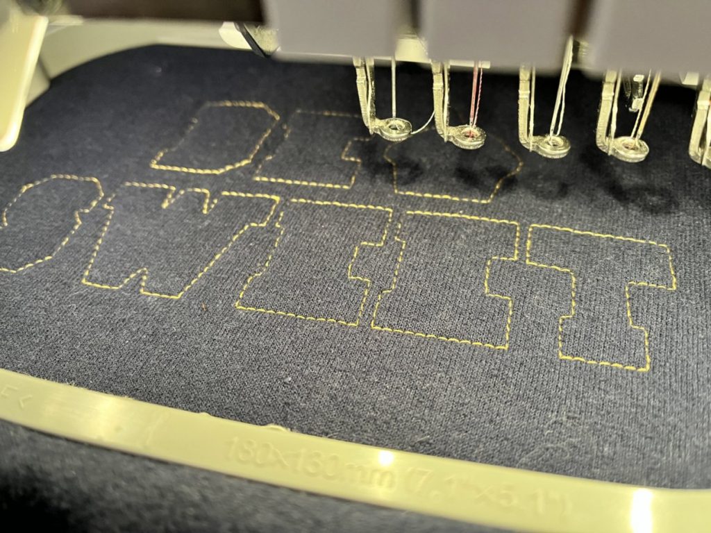
Let’s get started with the basics…
What is digitizing?
Digitizing is the art of creating design files that are read by embroidery machines.
What is a digitizer?
A digitizer is someone who creates design files. A digitizer can create files from their own artwork or they can use commercial clipart to base the designs on.
What is digitizing software?
Digitizing software is a computer program that the digitizer uses to create design files. The digitizer must use the software to communicate with the machine. We must tell it where to stitch, how to stitch, in which direction, in which order and which color. We tell it when and where to start and when and where to stop and how close together to place the stitches. There are too many factors to list. A digitizer has many, many elements to consider when creating a design. Different digitizing software packages allow different types of control over a design. Some are very simple and aimed at home-based embroiderers and hobbyists while others are very technical and are aimed at embroidery and digitizing professionals. In this article I will use Brother’s PE-Design as an example of home-based software and Wilcom’s Embroidery Studio 2 as an example of professional software.
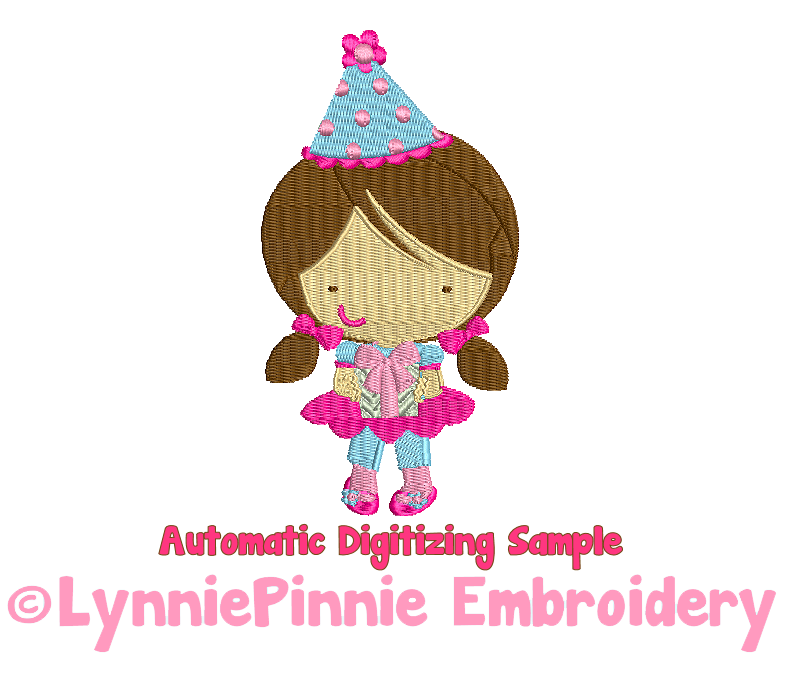
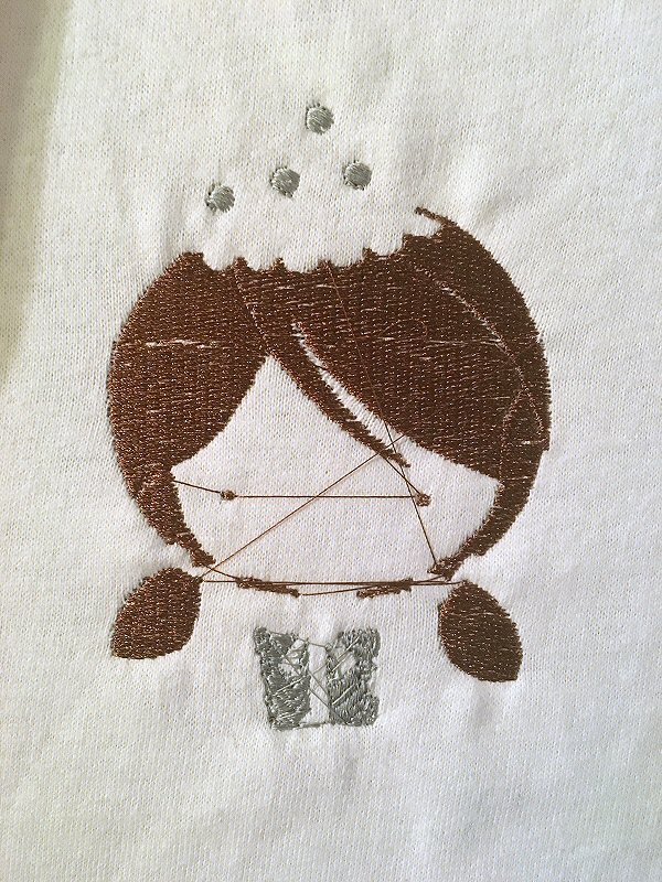
When I first started embroidering, I thought that I could simply find an image on the internet and send it to my machine and that somehow my machine would instinctively know exactly what to do. It wasn’t long before I realized that this is FAR from true! A digitizer must take the image and re-draw it using commands that an embroidery machine can understand. We can’t simply convert an image file to an embroidery file. Well…there are programs that will do that but let me show you why this very rarely yields good results. Taking an image file and using software to automatically create and embroidery file is called Auto-Digitizing.
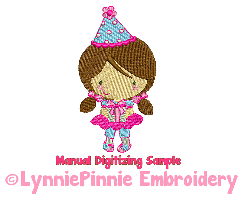
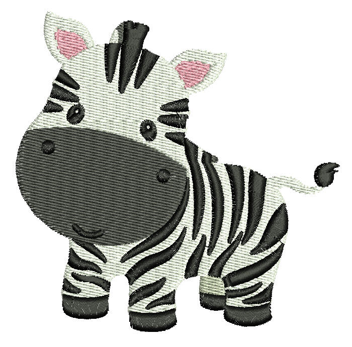
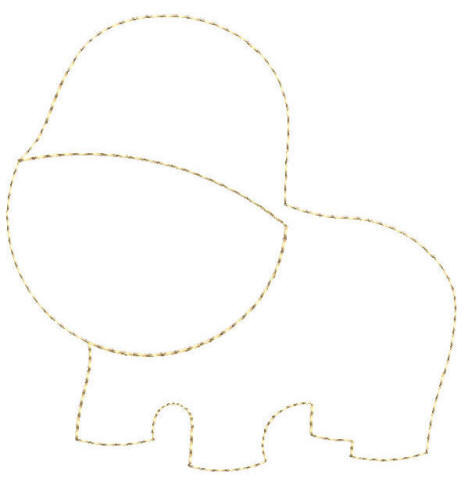
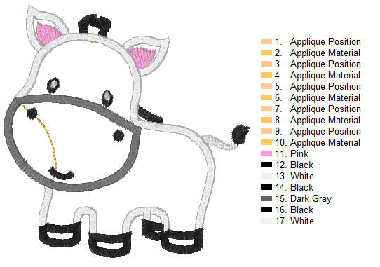
Auto-digitizing does not allow the digitizer to control the design. We can’t tell it where to start and stop or which direction to stitch or which type of stitch to use. Adjustments can me made but it is usually more time-consuming to fix an auto-digitized design than it would be to simply start from scratch. I’m going to use high-quality commercial clipart of a zebra throughout this article to illustrate different digitizing results.
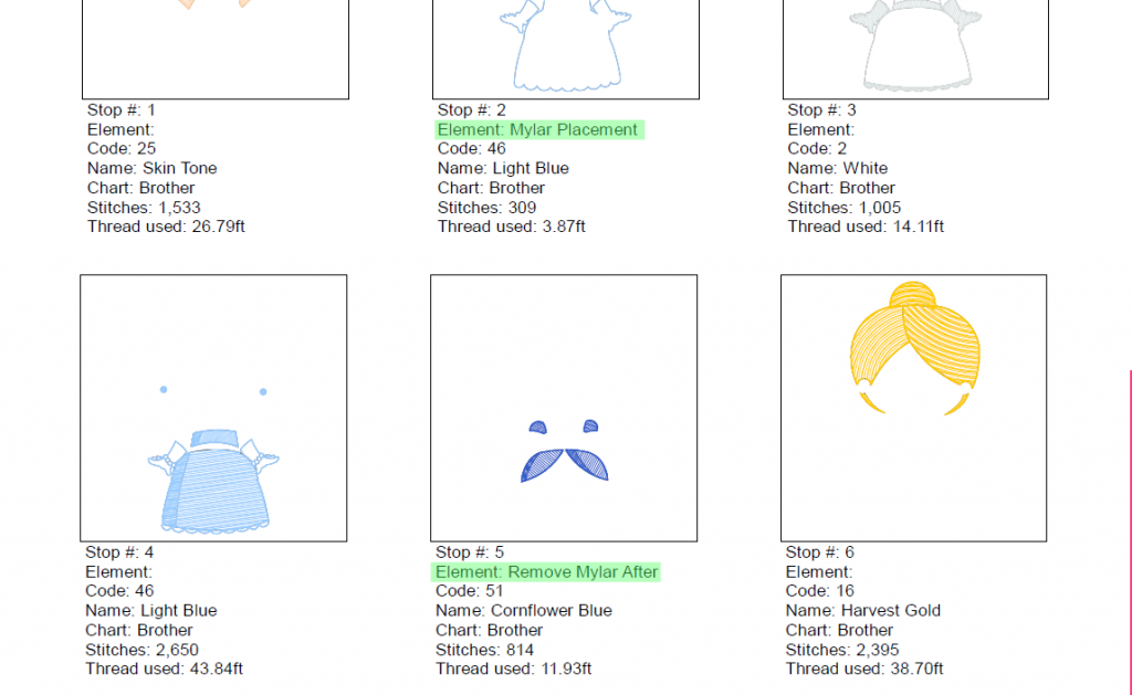
In this example I ran the zebra image through Brother’s PE-Design Software. I used the “image to stitches” function.
The results are nothing short of terrible. (You can download this disaster HERE if you would like to see for yourself)
So, what wrong with this design? First of all, it isn’t very nice-looking. There isn’t much definition. The stitches appear choppy and gapped. There are some other flaws that you can’t see here but that will absolutely contribute to the poor quality of this design. Look at the white background area that the software added. This should be negative space (nothing there). The stitches are running at different angles and are different lengths. THERE IS NO UNDERLAY STITCHING ANYWHERE <–BIG Problem!
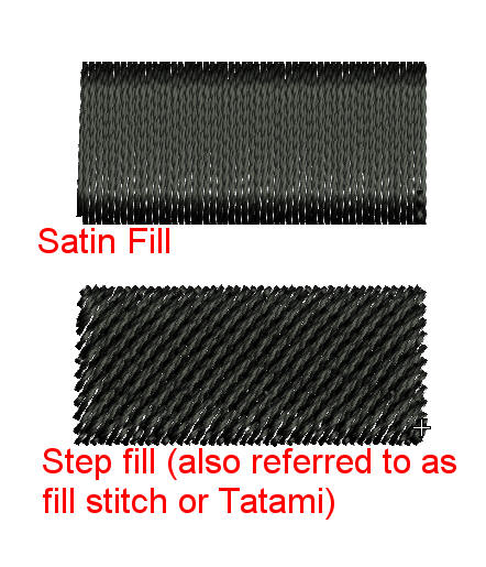
What is underlay stitching?
Underlay stitches are stitches that run before a block of stitching. They are usually more widely-spaced than fill stitches. Think of the underlay stitches as your foundation. They are there to support the stitches and prevent the design from shifting, puckering, and many other disastrous outcomes (think hole in a tee shirt!). You don’t want to build a house without a foundation.
Let’s look at the black. First, it is full of jump stitches.
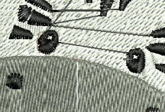
What are jump stitches?
Jump stitches are the long stitches that run when the machine stitches in one area and then picks up and moves to start stitching in a different area. Some machines will trim these stitches for you.
A skilled digitizer will minimize jumps by telling the machine to make the smallest jumps between objects. We must sequence the elements of a design so the they stitch in order by how close they are to each other. Think about crossing a river by stepping on stones. You are going to want to step to the next closest stone, not take one giant leap forward over five stones and then three backward and two forward, right? Almost all of the long jumps in this design could be minimized. I’ll explain more about that later…
Still looking at the black…look at the way the stitch angles change direction and how the stitch types are different. Some are a fill stitch (the stitch type you see in the white background area) while some are satin stitch, the smoother stitching that you see on some of the stripes, inconsistently. The stitch areas are broken up into chunks rather than continuous, free-flowing shapes. A good example would be the eyes.
The software added some yellow in there as well as some brown on the side of the face and pink under some of the stripes. There are 72 color changes in this design! I don’t think I need to explain what a pain THAT is! There are many other issues with this design, too many to describe.
Overall results? Terrible (in my opinion).
Next, I ran the same image through Wilcom’s Embroidery Studio 2 “Smart Design”.
The results are not as unattractive as the first auto-digitized design but this is still FAR from a quality design.
(You can download this less-than-quality design HERE) The scary thing about a design like this is that you might actually purchase a design that looks like this! It’s not so terrible that you would write it off as a “bad design” right away.
So, what wrong with this design? Again, THERE IS NO UNDERLAY STITCHING ANYWHERE <–BIG Problem! You’re going to get shifting and gaps and thread breaks. You don’t want to build a house without a foundation.
The angle of the white, pink, and grey stitches is the same. All of the stitching is running in the same direction! <–Another BIG Problem!
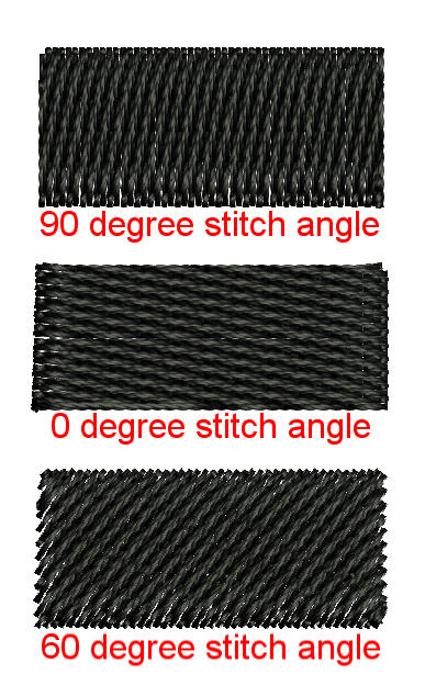
What are stitch angle and direction and why do they matter?
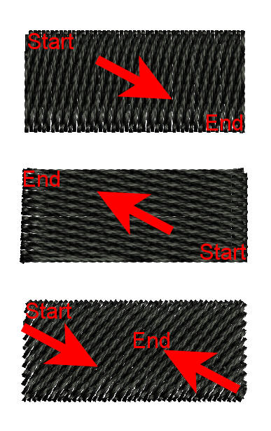
Stitch angle is the direction that the stitches are placed, horizontal, vertical, and every angle in between. Different angles products different effects. Stitch direction is the direction that the stitches run as they sew. Start on the upper left, end on the lower right, start on the lower right end on the upper left, or some designs will start on one side and fill partial areas and then travel to the other end and change direction to come back and meet in the middle.*
*My personal preference is to avoid designs that do that because they tend to gap where the stitches meet, especially if the filled stitch area is large. Sometimes it is an intentional move by the digitizer to minimize a jump stitch but many times it is a software default that the digitizer didn’t take the time to replace with his/her own settings.
Stitch direction is also important because a design must have balanced angles and directions to avoid shifting and bunching. If all of a design’s stitches run at a 45 degree angle from left to right then there is going to be a lot of left to right, top to bottom movement in the hoop. If the designs has outlines or details they will most likely be off, and it can cause some distortion of the design’s shapes.
If you see a design that has the same angle on all of the stitches then I would say it is safe to assume that the stitch directions are also going to be automatic or all the same and I, personally, would avoid that design.
Again, we have some choppy and uneven areas in the pink part of the ears. There are also some jumps within the same color which are totally unnecessary and unavoidable and, once again, the solid eyes are broken up into chunks rather than continuous, free-flowing solid shapes.
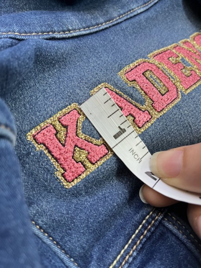
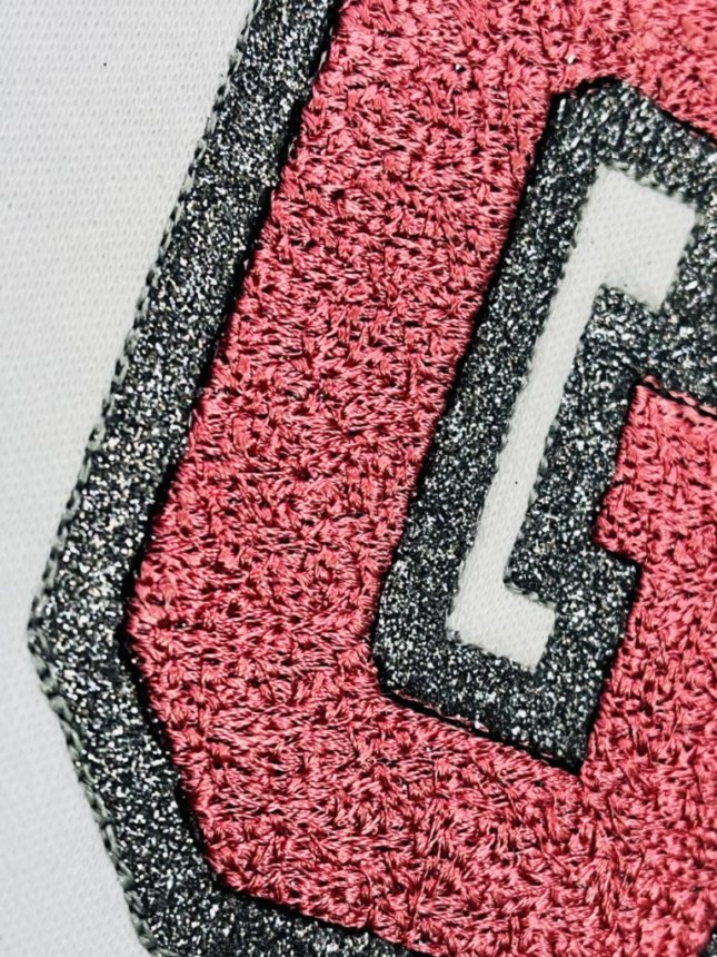
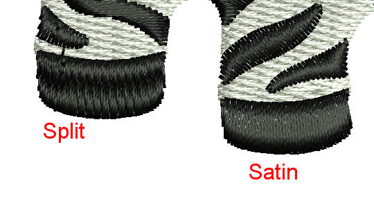
The black stripes and tail are all satin stitch and some of them appear to be too wide to use a satin fill. Some machines won’t stitch wide satin stitches and they can also snag easily. Those areas should be a split satin, where the machine will make some extra stitches to keep the stitch length shorter in the wider parts. The one time you DO NOT want to see satin stitches split is on a satin applique border. That means the satin outline is too wide. Another thing to note here is that the split example is split consistently across and not just in parts. If I have to split a section of satin stitches, I will make sure to split all of the stitches and not just the wide parts. When a digitizer uses their software’s auto split function you will end up with an uneven split that looks like dimples in the wider segments. This is particularly common in auto-digitized monograms and fonts.
Overall results? Bad, but possibly usable with lots of cleaning up (in my opinion).
On to the next…
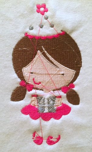
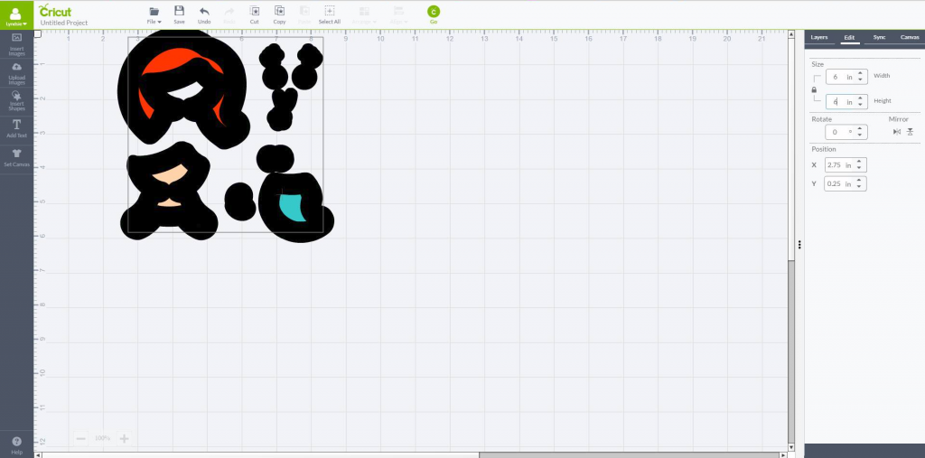
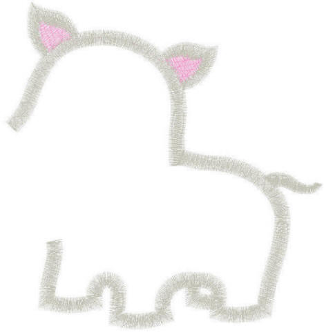
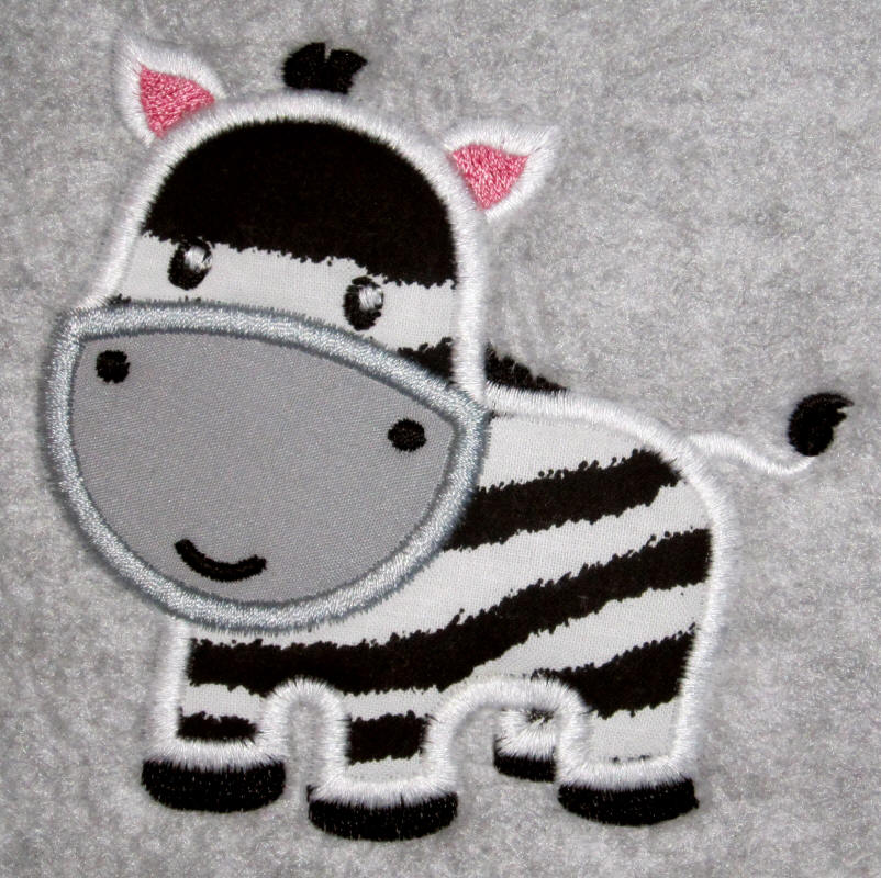
I used Brother’s PE-Design software to manually digitize the same zebra in applique form, and I did the sloppiest job I possibly could! Just a little note…PE-Design is a full digitizing program and it is actually the first program I started with, but it is VERY limited in what you can do with a design. I think it is great software for personal use but not professional use (personal opinion). If you do decide to give it a try (it is very simple and easy to learn as far as digitizing software goes) keep in mind that its tie offs are poor and you will need to manually draw lock stitches, it doesn’t render curves or corners well but you can work around that with the manual punch tool and extra nodes and I always manually drew my underlay stitches as well. A good, very experienced digitizer can work around software limitations. That being said, I didn’t take any of those extra steps in my example of poor digitizing. (You can download this sloppy applique design HERE)
Let’s take a look at what I threw together in about 30 minutes:
We’ll look at it piece by piece. First are the placement and tack down stitches. I intentionally left these sloppy with overlapping pieces. Overlapped fabrics can show through and cause thick, uneven areas for the machine to stitch over. Most of the time these can be eliminated.

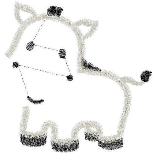
Next are the ear details. This step has no underlay and an unnecessary jump that can be eliminated. In applique designs you really shouldn’t see any jumps in the first few layers, especially in the satin outlines. They can almost always be eliminated with some extra effort from the digitizer. Jumps between eyes or within detail steps that stitch last are normal and can’t be avoided. Jumps early in a design, especially within the satin steps, are telltale signs of a design that was put together quickly (make more designs, sell more designs!) or possibly the work of an inexperienced digitizer. Most of the time they can be trimmed and you will never know they were there but why make more work for the embroiderer and slow the machine down since it has to stop and tie and trim and jump and then move on to the next part of the design? I prefer to keep it flowing.
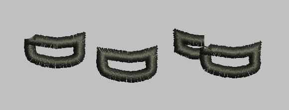
Next are the black details. Again, no underlay, the satin applique outlines are too thin and multiple unnecessary jumps which can almost completely be eliminated. The mouth is sloppy with open, boxy ends. All of the details are the same stitch direction and angle. The mane and hooves are very tiny pieces of fabric that would work better in a filled stitch and the way PE-Design rendered the corners is odd and not visually appealing. Those overlapped corners are unattractive and are hard on your machine, not to mention bulky where the threads sit on top of each other.
Next is the white satin outline. This is a total disaster!! ALL of these jumps can be eliminated with the exception of the whites of the eyes. Again, no underlay, satin is too thin. Filled areas are the same angle and direction.
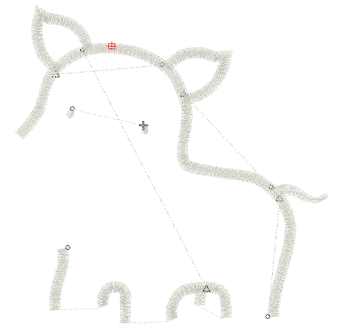
Last we have the snout. Is that what it’s called on a zebra?! Anyway, the satin is too thin and there is no underlay. Also, see how it looks kind of wobbly and wonky? That’s how PE-Design renders curves and I didn’t bother to clean it up.
Let’s take one last look at this example of a BAD design.
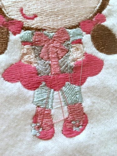
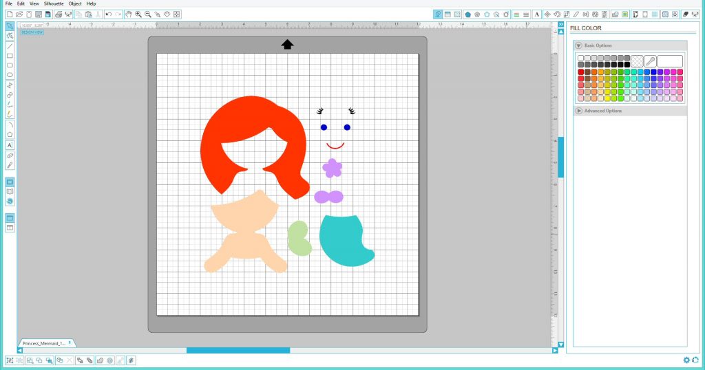
And here is the finished design.
Surprising, isn’t it! You probably thought it would look much worse. This concerns me because I might purchase a design based on a photo like this if I didn’t know better. This was a nightmare to stitch. It jumped all over the place so my machine was stopping a lot and I had some shifting since there was no underlay. Also, the tie-offs are inadequate and I had a LOT of unraveling. My tack down stitches unraveled so the fabric wasn’t secured well and there were loops at the beginning of all of the satin stitch segments because the tie-in was just not good, only two stitches! The lack of a good tie-in also caused loops on the mouth. The hooves shifted a bit which left one edge of the fabric completely exposed. The fabric will probably pull out from under that thin satin (remember, this design has NO underlay). This is a good example of how a decent-looking finished design has nothing to do with the quality of the design. A terrible design can actually look OK when finished. It doesn’t make it any less terrible, though! This design was very unpleasant to stitch and will not hold up over time. I doubt it would last through one wash on a T-shirt.
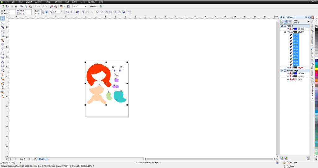
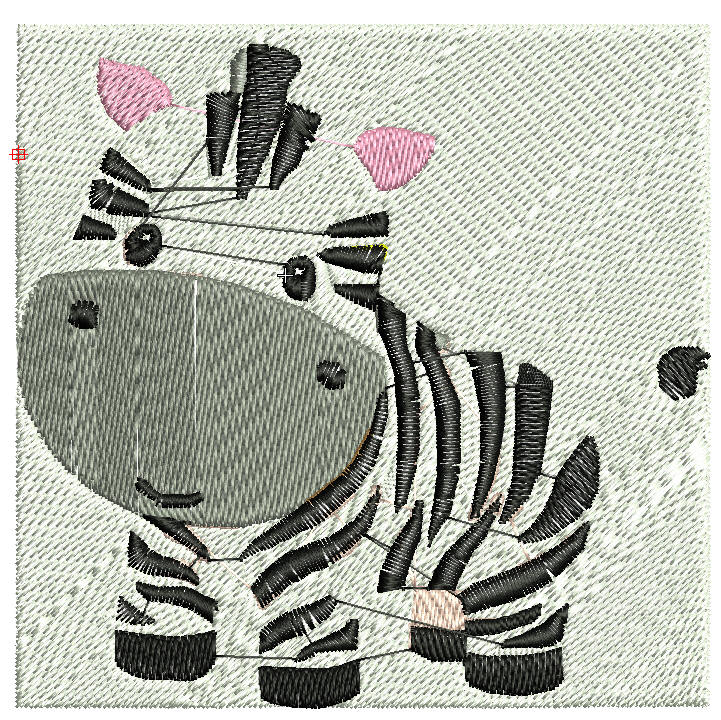
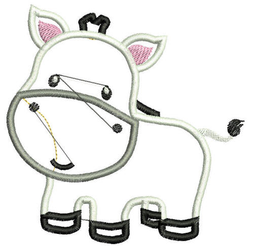
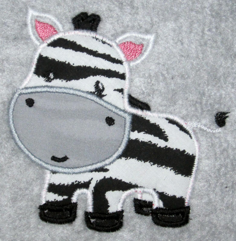
Last but not least, I manually digitized the same zebra clipart in Wilcom Embroidery Studio 2 and I took all of the extra steps to make this design stitch out great. Not only is the finished product going to look awesome, this design is going to be easy and stress-free to stitch!
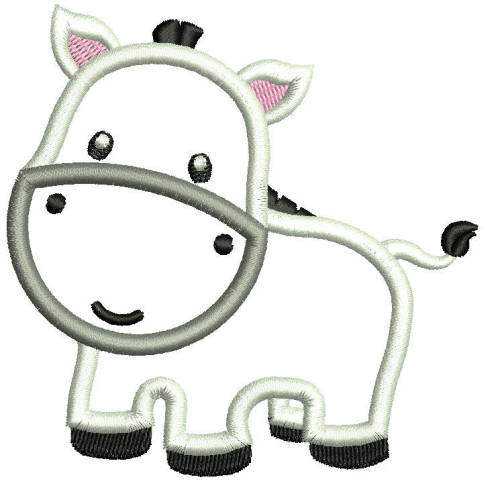
Let’s look at some of the features that make this design a good one.
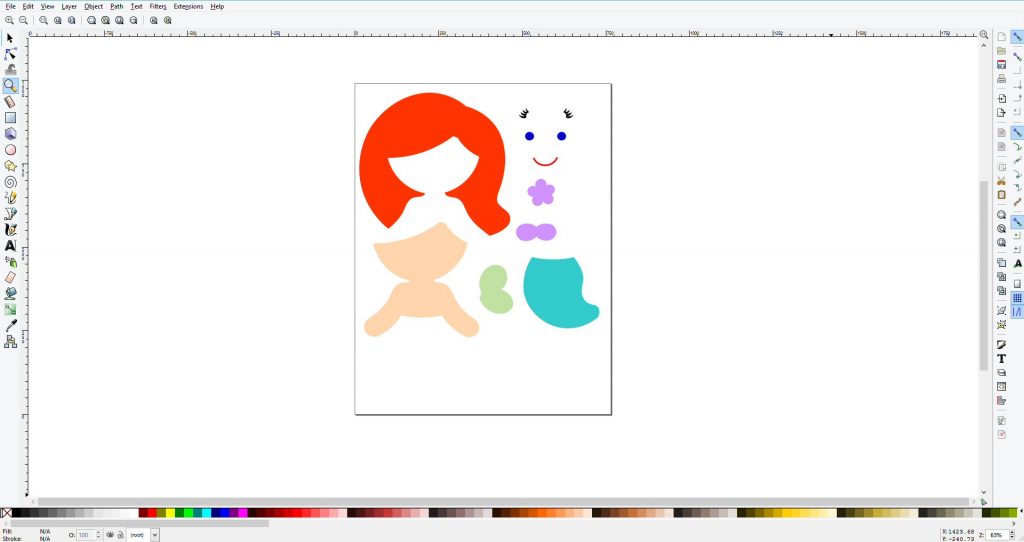
No overlapping fabric pieces.
No unnecessary jump stitches. The ONLY jumps in this design are between the facial features. And folks, WE HAVE UNDERLAY! A good design rests on a good foundation.
The satin stitches are wide and the design is smooth, not wobbly and wonky looking. The teeny tiny applique pieces have been changed to fill stitches. The fill stitch areas have appropriate stitch angles and push and pull compensation applied. No shifting, no gapping, no bunching. The mouth is rounded out and smooth. No more chop-block ends. The mane and tail have cute details enhanced.
In a nutshell, this design has been properly sequenced to minimize color changes, jump stitches and overlaps, a variety of stitch types and angles are used to balance out the push, pull, and flow of the design, underlay is a strong foundation, wide satin stitches secure your fabric and it’s CUTE! (You can download this adorable and easy-to-stitch applique design HERE)
I hope this helps to explain what to look for and what to avoid when looking for quality applique and embroidery designs. There is so much more information that I don’t have room or time to type out! Here are some side-by-sides to help you compare:
I hope you enjoyed and learned from this post. Happy Stitching!